kraftwerk
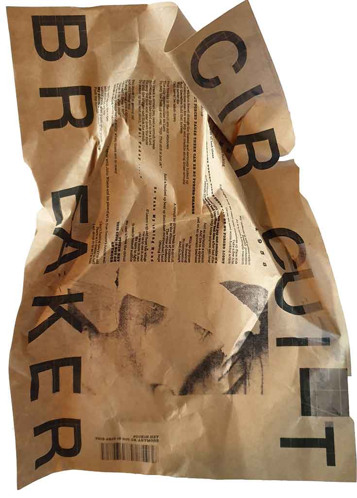
I came across two things pretty much in the one hit - kraft paper - and that crumpled up paper method method of displaying a piece of work
on inspiration
There is this epic idea that you have used inspiration well when you can hold up all your inspiration next to your work and be comfortable saying to someone, "hey this is what I created and this is what inspired me". If you are not comfortable doing that then your work is too close
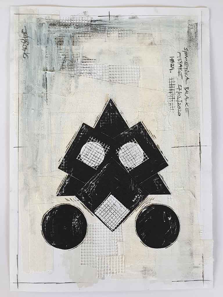
Sym/etry
This was the too literal / no mystery / no nuance / actually looks too much like something outcome from the balance through symmetry exercise. I wasn't into it. But did love the process
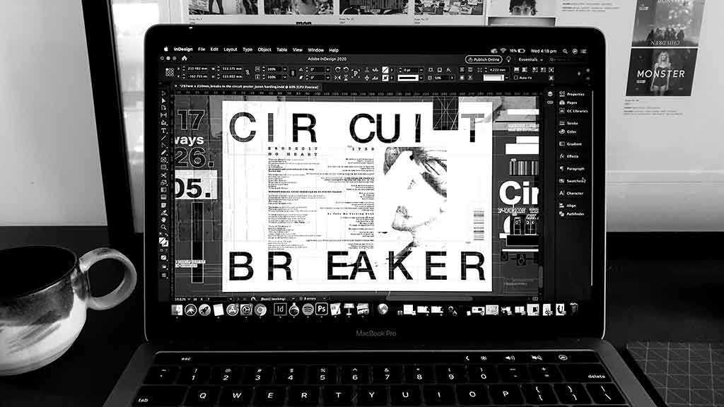
Indesign is Sexy
This was me working on the 'Circuit Breaker' poster. Indesign is sexy. All those lines and visuals and mysterious instruments and controls. Like a fighter pilots' cockpit


